







 Web Based Solutions



 Mobile App Development








 UI/UX Design
 Digital Marketing


 Quality Assurance


 Managed IT Services
 Web Developers











 Mobile App Developers



 Frontend Developers



 Open Source Developers







 Microsoft Certified Developers



 Cross Platform Developers

 Quality Assurance

 Microsoft
 Open Source
 JS Frameworks
 Business Models
 Intellectual Property Protection
 IT Consulting Services
 IT Outsourcing Services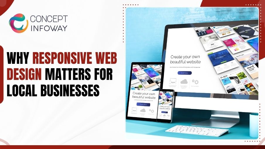
Why Responsive Web Design Matters for Local Businesses
Local businesses often lose leads for a simple reason: their website looks fine on a desktop but breaks the experience on a phone.
Responsive web design solves that problem by making one website adapt cleanly across screen sizes, so customers can read, tap, call, and buy without friction. For a business competing in a local market, that difference affects trust, visibility, and conversions.
This article explains why responsive web design matters, what it changes for local search and user experience, and how to evaluate whether your current site is helping or hurting your business.
You will also see how mobile friendly website design, mobile first design, and adaptive web design Services compare in practice, so you can choose the right approach with more confidence.
Why Local Businesses Cannot Ignore Responsive Web Design
Responsive web design is no longer a nice-to-have feature. It is the baseline expectation for how customers interact with a business online, especially when they are searching on a phone from a car, sidewalk, office, or home.
For local businesses, the website usually serves a very specific job: get the visitor to call, book, request directions, ask for a quote, or place an order.
When the layout does not adjust well on smaller screens, that job becomes harder. Text is harder to read, buttons are too small, forms are frustrating, and important content gets buried.
How Customer Behavior Changed
Most local searches now happen on mobile devices. That means a visitor often arrives with immediate intent, not casual browsing. They may be comparing a few providers, checking hours, looking for service details, or deciding whether to contact you now.
If the site loads slowly or requires pinching and zooming, many visitors leave before they ever learn what you offer. In practical terms, that means responsive design affects both first impressions and revenue opportunity.
What Responsive Web Design Does Differently
A responsive layout automatically adjusts content, navigation, images, and spacing based on the screen size. Instead of building separate desktop and mobile experiences, the same site reorganizes itself to stay usable.
That matters because a local business website usually has limited patience from the visitor. The easier it is to scan your services, click your phone number, or submit a lead form, the more likely the site will support the business goal.
Where Businesses Often Miss the Problem
Many owners only test their site on a large laptop screen, where everything appears fine. The real issues show up on a smaller phone: a banner pushes the main message down, a menu becomes awkward, or a contact form is too long to finish comfortably.
We often see businesses with strong services and weak mobile presentation. The issue is not the offer itself. It is the experience customers have when they try to act on it.
Turn Every Visitor into a Customer with Responsive Web Design
Get A Free QuoteHow Responsive Web Design Supports Local SEO and Lead Generation
Search visibility and usability are closely connected. A site that performs well on mobile sends stronger signals to both users and search engines, which is especially important for local businesses that depend on nearby searches.
Responsive web design Trends helps your marketing work more efficiently because it reduces friction at the exact moment someone is ready to take action. That can improve engagement, lower bounce behavior, and make calls, quote requests, and form submissions more likely.
Why Mobile Experience Matters for Local Search
When someone searches for a local service, search engines want to show results that are useful on the device being used. A page that loads cleanly, reads well, and provides clear next steps is more likely to hold attention.
This does not mean responsive design alone will rank a site at the top. But it removes a major barrier. If your website creates a poor mobile experience, your content, reviews, and service strength have to work harder to overcome it.
The Connection Between Layout and Conversions
A responsive layout does more than make content look better. It affects what the visitor notices first and how easily they can move toward contact.
A few examples make this clear:
- A click-to-call button that stays visible on mobile can turn a quick visit into a direct inquiry.
- A concise service page with readable sections helps someone decide faster.
- A short, well-placed form can capture interest before the visitor gets distracted.
Each of these improves the odds that local traffic turns into a real lead.
Why Local Businesses Need Clarity, Not Just Style
Local buyers often want practical information quickly: service area, pricing range if available, response time, hours, and what happens next. A responsive layout helps present those details without clutter.
That is one reason our team at Concept Infoway treats design as a business tool, not just a visual project. When the website structure is planned well, the mobile experience supports the customer journey instead of fighting it.
What Makes a Strong Responsive Layout on Real Devices
A responsive layout is only effective when it works in the situations your customers actually face. That includes older phones, smaller displays, spotty mobile connections, and users who are trying to complete a task quickly.
The best layouts are not the flashiest. They are the ones that make a visitor feel like the site was built for ease of use.
Core Elements That Should Adapt Smoothly
A strong responsive website usually handles several essentials well:
- Navigation remains simple and easy to tap.
- Text stays readable without zooming.
- Images resize without breaking the page.
- Buttons and forms are spaced for thumb-friendly interaction.
- Key calls to action stay easy to find.
When these pieces work together, the experience feels natural instead of forced.
Why Mobile First Design Is Often the Smarter Starting Point
Mobile first design begins with the smallest screen and then expands outward. That approach encourages teams to prioritize the most important content first, which is useful for local businesses with limited attention spans from visitors.
It also helps avoid the common mistake of cramming desktop content into a mobile screen. Instead, the site starts with clarity, then adds complexity only where it improves the experience.
Responsive Web Design vs. Adaptive Web Design
Responsive web design and adaptive web design are sometimes confused, but they are not the same.
Responsive design uses flexible grids and fluid scaling so the layout adjusts continuously across screen sizes. Adaptive design uses predefined layouts that switch at specific breakpoints.
For many local business websites, responsive design offers a smoother and more efficient experience because it is easier to maintain and usually handles the range of modern devices more naturally. Adaptive design can still make sense in some cases, but it should be chosen deliberately, not by habit.
Why Consistency Matters Across Pages
A site may look acceptable on the homepage but fall apart on service pages, landing pages, or blogs. That inconsistency confuses users and weakens trust.
A dependable responsive site keeps the experience stable from page to page. That consistency matters because local customers often decide based on one or two pages, not a full browsing session.
Is Your Website Losing Mobile Visitors? Upgrade It Today
Get A Free QuoteHow to Tell Whether Your Current Website Is Mobile Ready
Many business owners suspect their site has issues but are not sure how serious the problem is. A quick review can usually reveal whether responsive web design is helping your site or holding it back.
The goal is not perfection. The goal is to identify friction points that could be costing leads.
Common Warning Signs
If your site has any of the following issues on mobile, it likely needs attention:
- Users must pinch and zoom to read content.
- Menus are hard to open or navigate.
- Phone numbers and buttons are too small to tap easily.
- Forms are long, cramped, or awkward to complete.
- Images or sections extend beyond the screen.
These problems may seem small, but they often create enough frustration to push visitors away.
A Practical Testing Routine
You do not need a technical background to spot many responsive issues. Start by opening your site on a modern phone and ask a few simple questions: Can I find the main service in seconds?
Can I call without hunting for the number? Can I read the page comfortably with one hand?
Then test the same page on a tablet and a desktop. A strong site should feel consistent while still respecting each screen size. If the mobile version feels like an afterthought, the design needs work.
The Business Cost of Ignoring Mobile Problems
A poor mobile experience can quietly affect revenue over time. Visitors may still come from search, social, or ads, but they leave before converting. That means you spend money generating traffic without getting the full return from it.
For local businesses, this is especially expensive because lead volume is often limited. Losing even a small percentage of qualified visitors can have a noticeable effect on the pipeline.
According to Mordor Intelligence, the global web design market is projected to grow from USD 61.23 billion in 2025 to USD 92.06 billion by 2030, registering a compound annual growth rate (CAGR) of 8.5% during the 2025–2030 forecast period.
What Local Businesses Should Expect from Professional Responsive Web Design Services USA
Not every website project needs the same level of redesign, but local businesses should expect more than a visual refresh. Professional responsive web design services USA should address structure, usability, content hierarchy, and conversion paths together.
That broader approach is important because a mobile-friendly site that still hides important information or frustrates users will not deliver its full value.
What a Good Project Usually Includes
A well-planned responsive project generally covers the following:
- Review of the current site and its mobile pain points.
- Layout planning for key pages and conversion points.
- Navigation and content restructuring for smaller screens.
- Image, speed, and form usability improvements.
- Testing across devices and browsers before launch.
These steps help ensure the design supports business goals, not just aesthetics.
What to Ask Before You Hire a Web Design Partner
Before choosing a provider, ask how they approach mobile usability, content structure, and page performance. A strong partner should talk about the customer journey, not just colors and fonts.
It also helps to ask whether the team can support related needs such as website optimization, WordPress work, ecommerce functionality, or custom web development if your site needs more than a simple template update.
At Concept Infoway, those conversations are part of how we help businesses match the website to the real work it needs to do.
Why Maintenance Matters After Launch
Responsive websites are not set-and-forget projects. New content, plugins, plugins conflicts, image updates, and third-party tools can all affect performance over time.
That is why ongoing checks matter. A site that was responsive six months ago can still develop issues after updates or content changes. Regular review helps keep the mobile experience stable and reliable.
You May also like: Why Local SEO Services Are Essential for Small Businesses
How to Plan a Responsive Redesign without Losing What Already Works
A redesign should improve the site, not throw away every element that already performs well. The best projects preserve useful content and user behavior while fixing the areas that create friction.
That balance is important for local businesses that already have rankings, traffic, or customer familiarity with the current site.
Start with Business Goals, Not Templates
Before selecting a design style, define what the site must accomplish. Do you want more calls, online bookings, quote requests, store visits, or consultation requests? The answer changes the structure.
Once the goal is clear, the layout can be built around the actions that matter most. That keeps the redesign practical and makes it easier to measure success after launch.
Protect SEO Value During the Update
A redesign can affect local SEO if it is handled carelessly. Pages may change URLs, content may be removed, or internal linking may weaken.
A careful redesign should protect important pages, preserve useful content, and keep search intent aligned. If your website already brings in local traffic, this part of the process deserves as much attention as the visual work.
Use Content That Works on Small Screens
Responsive design and content strategy should be planned together. Long blocks of text, vague headings, and buried contact information make even a well-built site feel difficult.
Instead, use clear service descriptions, scannable sections, and direct calls to action. That approach helps visitors move quickly from interest to contact, which is exactly what a local business website should support. Responsive web design gives this answer a clearer usability context.
Wrapping Up
Responsive web design matters because your customers are not judging your business on a desktop mockup. They are judging it on a phone, often while they are ready to take action. Responsive web design should support clarity from the first visit.
When the site is easy to read, easy to tap, and easy to trust, it works better for both local search and lead generation. Strong responsive web design makes local actions easier to complete.
If your current website is not delivering that experience, the problem is usually not just design. It is the way structure, usability, and mobile behavior work together.
A thoughtful responsive approach can help you present your business clearly and make it easier for customers to contact you. Responsive web design keeps the mobile experience aligned with the business goal.
For companies that need a practical, business-focused update, Concept Infoway can help plan and build a responsive web design that supports real-world use, not just a good-looking screen. A practical responsive web design approach helps every page work consistently.
FAQs About Responsive Web Design for Local Businesses
What Is Responsive Web Design in Simple Terms?
Responsive web design is a website layout that adjusts to different screen sizes automatically. It helps your pages stay readable, clickable, and easy to use on phones, tablets, and desktops.
Why Does Responsive Web Design Matter for Local Businesses?
Local customers often visit websites on mobile devices and want quick answers. A responsive site makes it easier to call, request directions, book service, or send an inquiry without friction.
Is Responsive Web Design Better than a Separate Mobile Website?
In most cases, yes. A responsive site is usually easier to maintain, more consistent for users, and better suited to modern devices than managing separate desktop and mobile versions.
How Does Mobile First Design Fit into Responsive Web Design?
Mobile first design starts with the smallest screen and builds outward. It works well with responsive web design because it encourages clear content, simple navigation, and stronger mobile usability.
What Are Signs My Website Is Not Mobile Friendly?
Common signs include tiny text, hard-to-tap buttons, broken layouts, and forms that are difficult to finish on a phone. If users have to zoom or scroll sideways, the site likely needs work.
Can Responsive Web Design Help Local SEO?
Yes, indirectly. A mobile-friendly experience can improve engagement and make it easier for visitors to stay on the page, which supports stronger performance in local search results.
What Is the Difference Between Adaptive Web Design and Responsive Web Design?
Responsive web design scales fluidly across screen sizes, while adaptive web design switches between set layouts at specific breakpoints. Responsive design is often the more flexible option for local business sites.
How Do I Choose Responsive Web Design Services USA for My Business?
Look for a team that understands mobile usability, content structure, SEO, and conversion goals. The right partner should build a site around how your customers actually use it, not just how it looks.


Shopify vs. WordPress: Which Is Better for E-commerce?