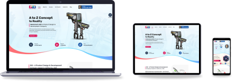
Why Responsive Web Design?
Why Responsive Web Design
Before we proceed further on why anyone should opt for Responsive Web Design, it is important for us to understand that what exactly a responsive website means. In simple words, a website that works flawlessly and appropriately, without any errors or difficulties in viewing and accessing on any devices of any screen size or orientation is known as responsive website.
Now if we look, technology constantly keeps on moving at a rapid pace, wherein internet has played a notable role. Amongst the many technological expansion, website is something that had always keep on changing and advancing with every new technology. Gone are the days when websites was something like a written piece of information on the web, as nowadays websites are more and more attractive and indulging, and at the same time involving the audiences. From shopping to information, hotel reservations to flight ticket bookings and much more; websites have catered our almost every needs.
We are pleased whenever we came across a unique, attracting and at the same time user-friendly websites, and believe me that these websites are the key holders to generate maximum profit for the business.
However, with the availability of smartphone and tablets, along with easily internet connectivity; most people uses their smartphones and tablets to access the information and browse the websites. The problem is most of the current websites were designed normal, which relates that they were designed exclusively for desktops and laptops. What this means that these websites were unable to perform at their best on a smartphone or tablet devices.
The end result is that the user is left out with a website that perhaps works extremely well on their laptops or desktops, but when it comes to their smartphones or tablets than the website fails to please the user. The user have to zoom-in every time whenever they have to view or access certain information.
Besides, many users faces trouble in choosing the menu or get to the drop down list of the menu or to navigate to a particular selection of page of the website. That’s why responsive web design is important.
Dedicated websites for smartphones and tables was certainly proven to be the right solution, however these were the truncated versions of the main websites. Hence, the user was left with the limited information, or perhaps with almost no information.
Why Responsive Web Design Matters: Understanding these problems faced by the users around the world, responsive website design was a term coined back in 2011, and was implemented in 2012. The term become popular and globally accepted in a matter of time, and was listed as No.2 in Top Web Design Trends for 2012 by .Net Magazine.
Responsive website design enables the website designers to design a website that can work flawlessly on all devices, whether it is desktops, laptops, smartphones or tablets, irrespective to their screen size or orientation. The website automatically adjusts the fonts, images, menu structure, website layouts, etc. pertaining to the size of the device; hence, the user whether he / she is accessing the website from desktop, laptop, smartphone or tablet will experience the same comfort and user-friendly that he / she is expecting from a normal website. Some of the major advantages of Responsive website design are explained as below:
- Provides a solution for a universal website that works flawlessly and appropriately, without any errors or bugs, on almost every devices, whether it is desktops, laptops, smartphones or tablets, irrespective to their screen size or orientation.
- Provides user-friendly experience on all devices.
- No need to create separate websites for desktops, smartphones or tablets, as one website can work on all devices; thereby, saving a huge amount of money on the development costs.
- Unlike the truncated versions with mobile websites, the user is not left with limited information as the user will be able to access the complete version of the websites with almost every information on any devices.
- Can be developed on almost any Microsoft or Open Source technology.
Checkout our latest blogs on web design and CMS web development.

Finding a Professional & Affordable Web Design Company


