




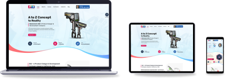



 Web Based Solutions


 Mobile App Development








 UI/UX Design
 Digital Marketing



 Quality Assurance


 Managed IT Services
 Web Developers











 Mobile App Developers



 Frontend Developers



 Open Source Developers







 Microsoft Certified Developers



 Cross Platform Developers

 Quality Assurance

 Microsoft
 Open Source
 JS Frameworks
 Business Models
 Intellectual Property Protection
 IT Consulting Services
 IT Outsourcing Services
10 Benefits of responsive web development for Businesses Growth
Responsive web development helps businesses create websites that remain usable, attractive, and effective across desktops, tablets, and smartphones instead of forcing visitors to zoom, pinch, or scroll sideways.
If your website looks polished on a large monitor but feels slow or difficult to use on a phone, you may be losing valuable opportunities before a potential customer ever contacts you.
A responsive website can support better user experiences, stronger search visibility, more efficient maintenance, and sustainable growth.
This guide explains 10 practical benefits of responsive web development, what businesses should evaluate before starting a project, and how to choose a development partner that can connect design decisions with measurable business needs.
Why Responsive Web Development Matters for Business Growth
Responsive web development is the process of building a website so its layout, content, navigation, images, and interactive elements adapt to different screen sizes and devices. It involves more than shrinking a desktop page.
A properly developed site rearranges content, adjusts spacing, supports touch interactions, and preserves important actions such as calls, form submissions, purchases, and account access.
For businesses, that flexibility matters because customers do not follow one predictable browsing path. Someone may discover a company through a mobile search, review its services on a tablet, and complete a form from a desktop computer.
The website needs to support each stage without making the visitor repeat work or question whether the business is reliable.
A Responsive Website Is More Than a Smaller Desktop Site
A responsive website layout uses flexible grids, scalable media, adaptable typography, and device-aware breakpoints. The goal is not to display every desktop element identically on every screen. The goal is to preserve the most important information and actions in the clearest possible format.
This is a practical consideration in responsive web development.
For example, a service page may place a consultation form beside the main content on a desktop screen. On a phone, that form may move below the service explanation, while a prominent contact button remains accessible near the top.
This is a business decision as much as a design decision: the layout should reflect what visitors need to do next.
Mobile Use Changes the Standard for Website Quality
Mobile visitors often browse in less-than-ideal conditions. They may have a weak connection, limited time, one hand available, or a small screen.
A page that technically loads on a phone may still fail if buttons are difficult to tap, text is cramped, or the primary offer is buried under decorative elements. This requirement should be planned within responsive web development.
This is why mobile-friendly web development should be evaluated through real user tasks. Can a visitor find a service? Can they understand the value quickly? Can they call, request information, add an item to a cart, or complete a form without frustration?
Those questions reveal more than a basic device preview.
10 Benefits of Responsive Web Development
The strongest reason to invest in responsive web development is that it improves several connected parts of the customer journey at once. The following benefits are not isolated design advantages; they affect usability, marketing efficiency, technical maintenance, and the way customers evaluate your business.
Benefit 1: Reach Customers Across More Devices
A responsive site gives customers a consistent starting point whether they arrive from a smartphone, tablet, laptop, or large desktop display. This is especially important for businesses serving people who research while traveling, working remotely, comparing providers, or making quick purchase decisions.
Without responsive behavior, a visitor may see clipped content, overlapping sections, unreadable text, or navigation that does not function properly. They may leave before learning what the business offers. A flexible experience removes that unnecessary barrier and makes the website available to a wider range of users.
This is a practical consideration in responsive web development.
Benefit 2: Improve User Experience and Accessibility
Responsive UI UX focuses on how people actually interact with a website. It considers readable contrast, logical spacing, touch-friendly controls, content hierarchy, form usability, and predictable navigation. These details can determine whether a visitor feels confident continuing or gives up.
A better experience does not mean adding more animations or visual effects. Often, it means reducing friction. Clear headings, well-spaced buttons, concise forms, and properly prioritized content help users complete tasks with less effort.
Responsive web development should also work alongside accessibility practices, although responsiveness alone does not make a website fully accessible.
Benefit 3: Support Search Visibility
Search engines evaluate the quality and usability of webpages across modern devices. A responsive implementation gives businesses a stronger technical foundation because one page structure can serve users across screen sizes rather than sending visitors to disconnected desktop and mobile versions.
Responsive development does not guarantee rankings. Search performance also depends on content quality, crawlability, page experience, technical configuration, relevance, authority, and many other factors. However, a mobile-ready website reduces avoidable usability problems and gives an SEO program a more reliable platform to improve.
Benefit 4: Reduce Visitor Drop-Off
People rarely tolerate confusing interactions when competing websites are only a search away. If the navigation is difficult to use or a form requires excessive scrolling, visitors may abandon the page even when the underlying service is a good fit. That principle is central to responsive web development.
Reducing drop-off starts with identifying the key actions for each page. A product page may need a visible purchase path, while a professional services page may need clear proof, service details, and a simple inquiry form. Responsive design keeps those actions usable as the screen changes.
Benefit 5: Improve Page Performance When Built Correctly
responsive web development can contribute to better performance when developers serve appropriately sized images, avoid unnecessary scripts, use efficient layouts, and prioritize content that appears first on the screen. Performance is not created by responsiveness alone, but responsive projects provide an opportunity to review how assets behave on smaller devices.
A common mistake is to make a desktop page flexible while still loading oversized images, heavy libraries, and unnecessary features on a phone. That approach may pass a basic visual test but still create a poor experience.
Performance testing should cover realistic devices and network conditions, not only a fast office connection.
Benefit 6: Create a Consistent Brand Experience
Customers form opinions from small details. A logo that shifts position, inconsistent button behavior, or a mobile page that removes important information can make a business appear less organized. A responsive website helps preserve brand presentation while allowing the layout to adapt naturally.
That principle is central to responsive web development.
Consistency does not require every screen to look identical. It means the tone, visual identity, terminology, and core actions remain recognizable. Visitors should understand that they are still interacting with the same business when moving between devices.
Benefit 7: Simplify Website Maintenance
Managing separate desktop and mobile websites can create duplicated content, disconnected updates, and testing gaps. A responsive implementation typically allows teams to maintain one primary website structure while serving different screen sizes through adaptable code and styles.
That can make routine work more efficient. When a business changes a service description, updates a product, or modifies a form, the team has fewer separate experiences to review. The development approach still needs sound architecture and testing, but consolidating the experience can reduce operational complexity.
Benefit 8: Strengthen Conversion Paths
responsive web development directly supports conversion when it makes important actions easier to find and complete. Calls, quote requests, registrations, purchases, downloads, and appointment inquiries should remain usable on the device where the visitor first decides to act.
Consider a local service company whose visitor searches for help from a phone. A desktop-first page may hide the phone number in a crowded menu or place the inquiry form far below the content.
A responsive approach can present the next step at the moment it is most useful, without interrupting the visitor’s understanding of the offer.
Benefit 9: Improve Analytics and Decision-Making
A unified responsive website can make it easier to analyze behavior across devices and understand where users encounter friction. Marketing and product teams can compare traffic sources, engagement, form interactions, ecommerce behavior, and other relevant events within a connected site structure.
Analytics still require accurate tracking configuration and careful interpretation. A high mobile bounce rate might indicate slow performance, unclear messaging, a poor landing-page match, or an audience that is only researching.
Responsive web development gives teams a better base for investigation, but measurement plans must be defined before conclusions are drawn.
Benefit 10: Prepare the Website for Future Growth
Businesses change. New services are added, product catalogs expand, campaigns introduce new landing pages, and teams begin serving customers through devices that were not part of the original launch plan.
A responsive foundation makes it easier to extend the website without designing every new page from scratch for a single screen size.
Future readiness does not mean predicting every device or adopting every new technology. It means using flexible components, clear content structures, scalable media, and maintainable code. That approach can reduce the risk that a website becomes difficult to update as the business grows.
This is a practical consideration in responsive web development.
What Should You Evaluate Before Choosing a Responsive Web Design Agency?
The right partner should understand both the technical implementation and the business purpose of the website. A visually attractive mockup is not enough if the final pages are slow, difficult to manage, poorly connected to analytics, or unclear about the actions customers should take.
This requirement should be planned within responsive web development.
Review the Discovery and Planning Process
A capable responsive web design agency should ask about your audience, business model, existing traffic, conversion goals, content, integrations, and operational constraints before recommending a layout. The questions may differ for an ecommerce store, a software company, a local service provider, or an organization with a complex sales process.
Ask how the team plans to identify important user journeys. If the discussion focuses only on colors and page appearance, important issues may be missed. Discovery should clarify which pages support awareness, evaluation, conversion, retention, and internal workflows. That principle is central to responsive web development.
Ask How Responsive UI UX Will Be Tested
Responsive behavior should be tested at more than one popular phone width. Different browsers, operating systems, input methods, font settings, and connection speeds can expose problems that a simple desktop resize does not show.
Ask whether testing includes menus, forms, navigation, buttons, image behavior, tables, pop-ups, checkout steps, and third-party integrations. Also ask how issues will be documented and resolved before launch. Practical testing is especially important for websites that depend on inquiries or online transactions. This can affect responsive web development outcomes.
Confirm That Content and SEO Are Included in the Thinking
A responsive layout cannot compensate for unclear messaging. Your development team should understand where service explanations, trust signals, calls to action, structured information, and supporting content fit within the page experience.
Technical SEO considerations may include crawlable content, heading structure, metadata, redirects, canonical configuration, indexability, internal linking, performance, and analytics. Exact requirements depend on the existing website and project scope, so they should be reviewed rather than assumed.
Consider Technology, Ownership, and Ongoing Changes
The best technical choice depends on your current platform, team capabilities, integrations, content workflow, security needs, and future plans. A business may need a content management system, ecommerce functionality, a custom web application, or a combination of services.
Before signing off, clarify who owns the code, content, design files, accounts, and analytics configuration. Also determine how future updates will be handled. A site that looks good at launch but is difficult for your team to maintain can become expensive in less obvious ways.
At Concept Infoway, responsive web development can be considered as part of a broader website project that connects design, development, optimization, SEO, and business goals. The practical outcome should be a website your customers can use and your team can manage—not simply a collection of attractive screens.
How Does Mobile-Friendly Web Development Support Long-Term Growth?
A responsive website is most valuable when it becomes part of a broader growth system. Design and code affect how efficiently marketing traffic is converted, how confidently visitors evaluate the business, and how easily internal teams publish improvements.
The website should therefore be planned around real growth constraints rather than treated as a one-time visual refresh.
Connect the Website to Marketing Campaigns
Paid search, social campaigns, email promotions, organic SEO, and referral traffic may all send visitors to different landing pages. Each page needs to make sense on the device and in the context where it is viewed. This requirement should be planned within responsive web development.
For example, a campaign may generate strong mobile traffic but weak inquiries. Before increasing the advertising budget, examine whether the landing page loads quickly, matches the ad promise, displays the offer clearly, and presents an easy-to-complete action on a phone.
Responsive development helps, but message alignment and offer quality matter just as much.
Use Conversion Data to Guide Improvements
Avoid redesigning every page based on assumptions. Start with evidence such as device-level conversion rates, form abandonment, search queries, support questions, usability observations, and recordings where appropriate and permitted. Then prioritize changes that address a meaningful customer or business problem. This can affect responsive web development outcomes.
A small improvement—such as reducing unnecessary form fields or making product filters easier to use—may be more valuable than a complete visual redesign. The right priority depends on the page’s role and the quality of the available data.
Build Components That Can Scale
Reusable components can help teams maintain consistency across service pages, product pages, blogs, landing pages, and application screens. However, reuse should not create rigid templates that prevent content from addressing different customer needs.
A useful component system allows controlled flexibility. It can standardize buttons, forms, spacing, alerts, cards, and navigation while still giving content teams room to present information appropriately. This balance supports faster publishing without making every page feel identical. That principle is central to responsive web development.
Plan for Security, Integrations, and Operations
Growth often introduces more than additional visitors. Businesses may add payment providers, customer relationship management systems, scheduling tools, marketing automation, inventory systems, or internal dashboards. Each connection creates testing, privacy, security, and maintenance considerations.
A development partner should identify these dependencies early. A page that works in isolation may fail when an external service changes, a form sends incomplete data, or a user accesses the process from a small screen.
Technical planning reduces the risk of discovering these problems after a campaign or product launch.
How to Implement Responsive Web Development Without Losing Business Momentum
A responsive website project should improve the customer experience without creating avoidable disruption for your team. The process is easier to manage when decisions are made in the right order and success is defined before development begins.
Define the Pages and Actions That Matter Most
Begin by identifying the pages that receive meaningful traffic or support important revenue and lead-generation activities. Review your top landing pages, service pages, product categories, contact paths, and high-value forms. The goal is to understand where mobile friction would create the greatest business impact.
For each priority page, document the primary action, supporting information, objections a visitor may have, and evidence that builds trust. This creates a practical basis for wireframes and content decisions. This can affect responsive web development outcomes.
Audit the Existing Experience Before Rebuilding
If you already have a website, review it on real devices and gather performance and analytics information. Look for layout shifts, inaccessible controls, large media files, unclear navigation, broken integrations, duplicated content, outdated plugins, and forms that do not work reliably.
An audit may show that some pages need a full rebuild while others need targeted improvements. That distinction can help control risk and keep effort focused on the problems that matter most.
Design Around Content Priorities
Responsive layouts should be designed with the actual content, not placeholder text alone. Long headings, comparison tables, testimonials, product options, pricing information, and forms can behave very differently from short sample copy. This is a practical consideration in responsive web development.
Write or organize essential content early enough for the design to account for it. Otherwise, a layout may look balanced in a mockup and become crowded when real business information is inserted.
Test Before and After Launch
Before launch, test the website across representative devices and browsers. Verify navigation, forms, calls to action, search, checkout or booking flows, images, videos, keyboard access, error messages, and integrations. Test both common and less obvious paths, such as returning to a page after an error or rotating a phone horizontally.
After launch, monitor performance, search visibility, analytics events, form submissions, and customer feedback. A launch is a starting point for learning. Continued maintenance is necessary as browsers, devices, content, integrations, and business priorities change. This can affect responsive web development outcomes.
Avoid Common Responsive Development Mistakes
Some issues appear repeatedly in website projects:
• Treating mobile as a late-stage adjustment after desktop pages are finished.
• Hiding important content or conversion actions simply because the screen is smaller.
• Loading desktop-sized images and unnecessary scripts on mobile devices.
• Measuring success by appearance alone instead of usability, performance, and business actions.
A disciplined process prevents these mistakes by involving mobile considerations from the beginning and tying implementation choices to customer tasks.
Wrapping Up
The 10 benefits of responsive web development extend beyond fitting a webpage onto a phone. A well-planned responsive website can help businesses reach more users, create clearer experiences, support search visibility, reduce maintenance complexity, strengthen conversion paths, improve measurement, and create a more adaptable foundation for future growth.
The important decision is not whether your website should respond to different screens; it is how thoughtfully that experience will be planned, built, tested, and maintained.
Review your highest-value pages, identify the mobile problems that affect customers, and choose a development partner that can connect responsive UI UX with performance, content, SEO, integrations, and business objectives. Concept Infoway can support businesses evaluating web development needs when a practical, user-focused digital solution is the next step.
FAQs About Responsive Web Development
What is responsive web development?
Responsive web development creates websites that adapt their layout, content, images, and controls to different screen sizes, including desktops, tablets, and smartphones.
Why is responsive web development important for businesses?
It helps businesses deliver a usable experience across devices, reduce mobile friction, support SEO efforts, simplify maintenance, and keep important conversion actions accessible.
How does responsive web development improve mobile user experience?
It adjusts navigation, spacing, typography, media, and interactive controls for smaller screens, helping visitors read content, tap buttons, complete forms, and find information more easily.
Does responsive web development improve SEO rankings?
Responsive development can support SEO by creating a mobile-ready, consistent site structure, but rankings also depend on content quality, relevance, technical SEO, authority, and page experience.
Is responsive web design better than creating a separate mobile website?
A responsive site commonly simplifies content management and creates one adaptable experience, while a separate mobile site may add duplication and maintenance. The best option depends on the existing platform and goals.
How much does responsive web development cost?
Cost varies according to page count, design complexity, platform, integrations, content, ecommerce or application features, and redevelopment needs. A project assessment is needed before estimating scope.
How do I choose a responsive web design agency in the USA?
Review the agency’s discovery process, responsive testing methods, development expertise, SEO awareness, communication, ownership terms, maintenance approach, and ability to connect design decisions to business goals.
Can Concept Infoway help with responsive web development?
Concept Infoway supports businesses with web design and development projects that can include responsive layouts, user experience, website optimization, SEO considerations, and platform-specific development needs.


7 Keys Ecommerce Marketing Trends Driving Online Sales